Unifying a fragmented product journey
Five siloed city-infrastructure apps forced operations teams to sign in across five systems. Inside an autonomous core unit, I architected one multi-tenant IoT platform that merged isolated data streams into a single, responsive hub.
- Role
- Product Designer / UX Marketing Manager
Interface architecture & testing - Company
- Taoglas
Smart-city IoT platform - Users
- City, fleet, finance & sustainability
managers; waste collectors - Tools
- Figma, Zeplin
Confluence, Jira
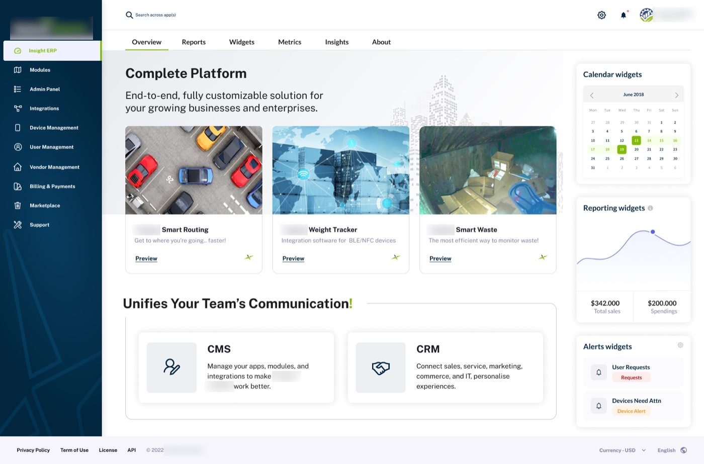
Five teams, one body of evidence
I interviewed product teams and end users of all five apps and studied the IoT landscape and legacy systems.
When five teams each own a piece of the truth, I make the whole system visible first. Then I design the screens.
From whiteboard to one platform
Each step answers a question the previous one raised. Here’s what I did, why I chose it, and what it changed.
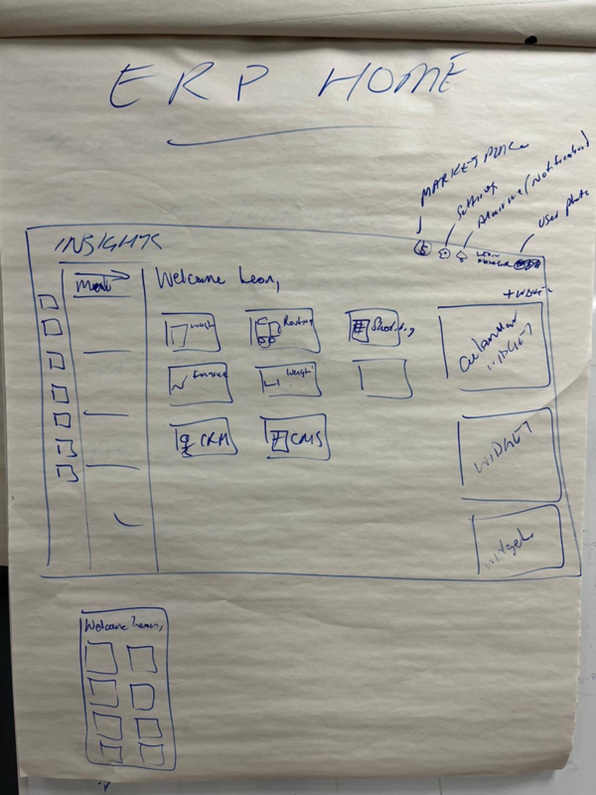
I got five teams in one room
Led a design-thinking summit with product owners, SMEs and developers, and whiteboarded the ERP home together.
Five teams had never seen each other’s workflows side by side. Alignment had to come before any screen.
A shared list of what every team needed on day one: devices, users, zones and dashboards.
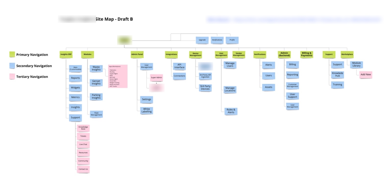
I put five apps on one map
Mapped the structure of all five apps into a single draft sitemap.
Overlaps and duplicates only become obvious when everything sits on one page.
One harmonized information architecture replaced five separate navigation models.
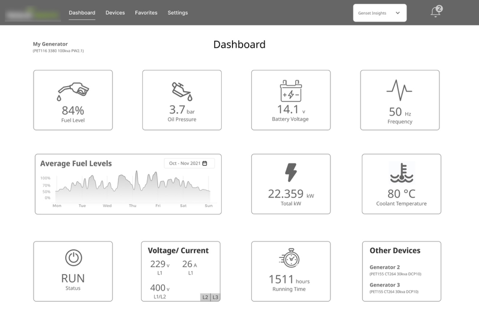
I shipped a first dashboard to learn from
Designed an early dashboard concept with device tiles and key readings.
A concrete draft gets sharper feedback than a description. I wanted teams to react to something real.
Engineering, product and marketing feedback sharpened icon labels and iconography and showed which UI the next version needed, like larger data visualizations.
I explored navigation before committing
Designed navigation variants for device management and the admin panel.
One menu had to serve five roles without turning into five menus. Comparing variants side by side made the tradeoffs visible.
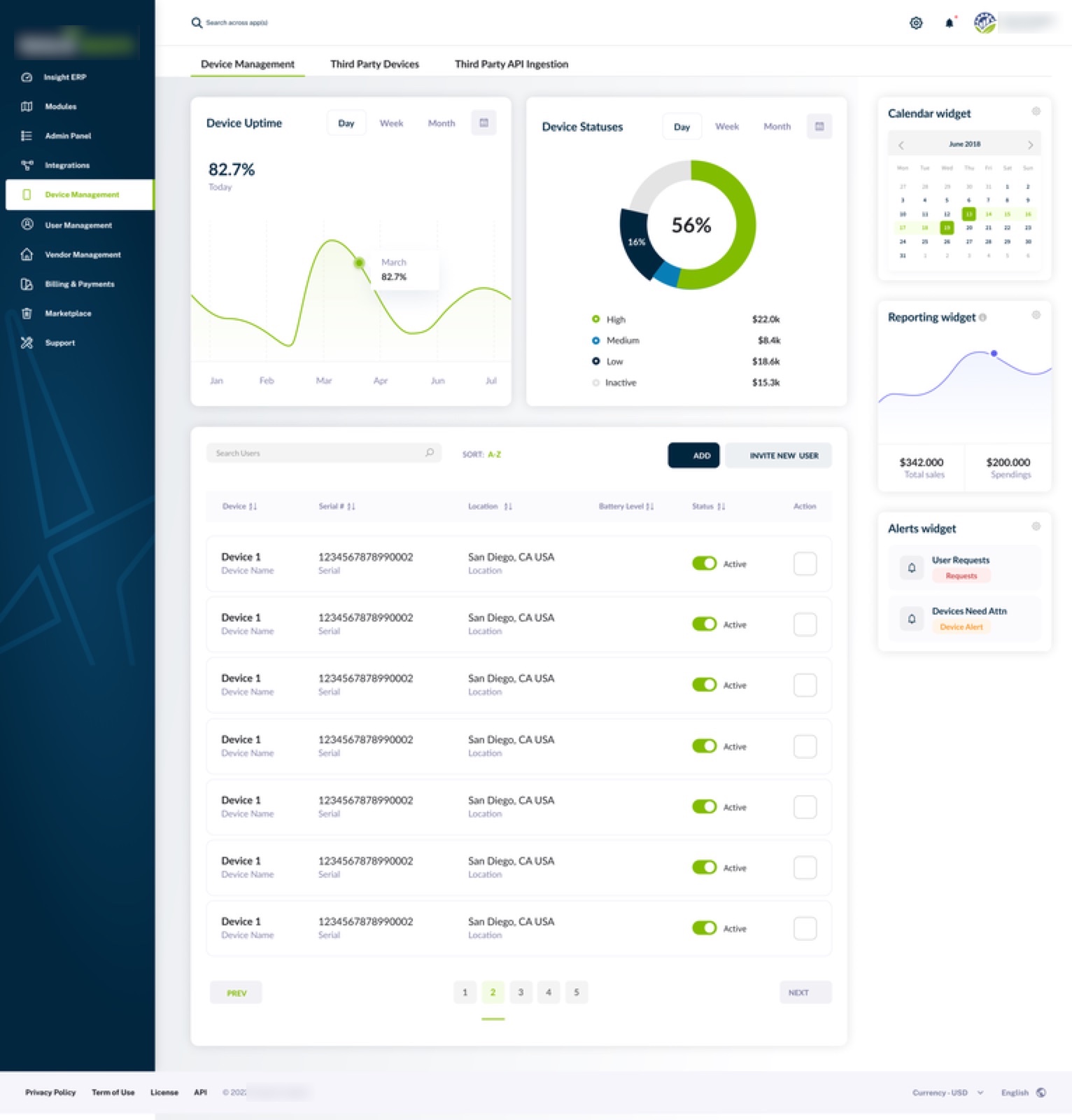
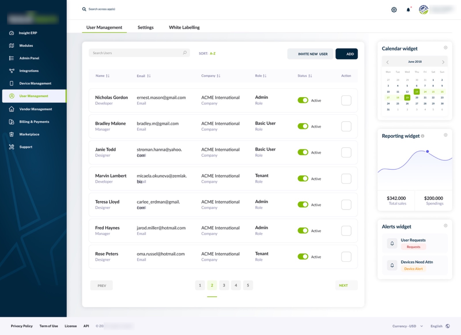
The chosen direction added larger, glanceable data visualizations, tables for essential data, and a calendar widget for quick date changes.
I validated every iteration with the people who’d use it
Moved lo-fi to hi-fi in Figma, reviewing each round with product owners, SMEs and engineers.
With five audiences, a design that pleased one team could quietly break another. Frequent reviews caught that early.
Role-based, real-time dashboards, from fleet routing and cost tracking to crowd analytics.
Designing without full system access
Some systems were too abstract to map, and access to others was restricted for good reason. So we gathered the essential UI and information we could, and studied competitors’ systems to learn what users would expect, so the design landed on the first try.
From five device lists to one management view
One destination for every operations team
During COVID-19, the platform’s CROWD Insights™ analytics was offered free of charge to a leading Irish hospital, and at cost to other health systems.