Optimizing care delivery with AI
I led three designers and research on a brand-new, AI-enabled intake for orthopedic patients and their care teams. My job was to make getting started easy for first-time, often senior users, and to make sure care teams heard about risk the moment it appeared.
- Role
- Associate UX Director
Led 3 designers + research - Company
- Zimmer Biomet
Patient & care-team products - Users
- Patients, care teams,
surgeons, hospital admins - Tools · Timeline
- Figma, Miro, Claude Code
Concept → validated in 20 days
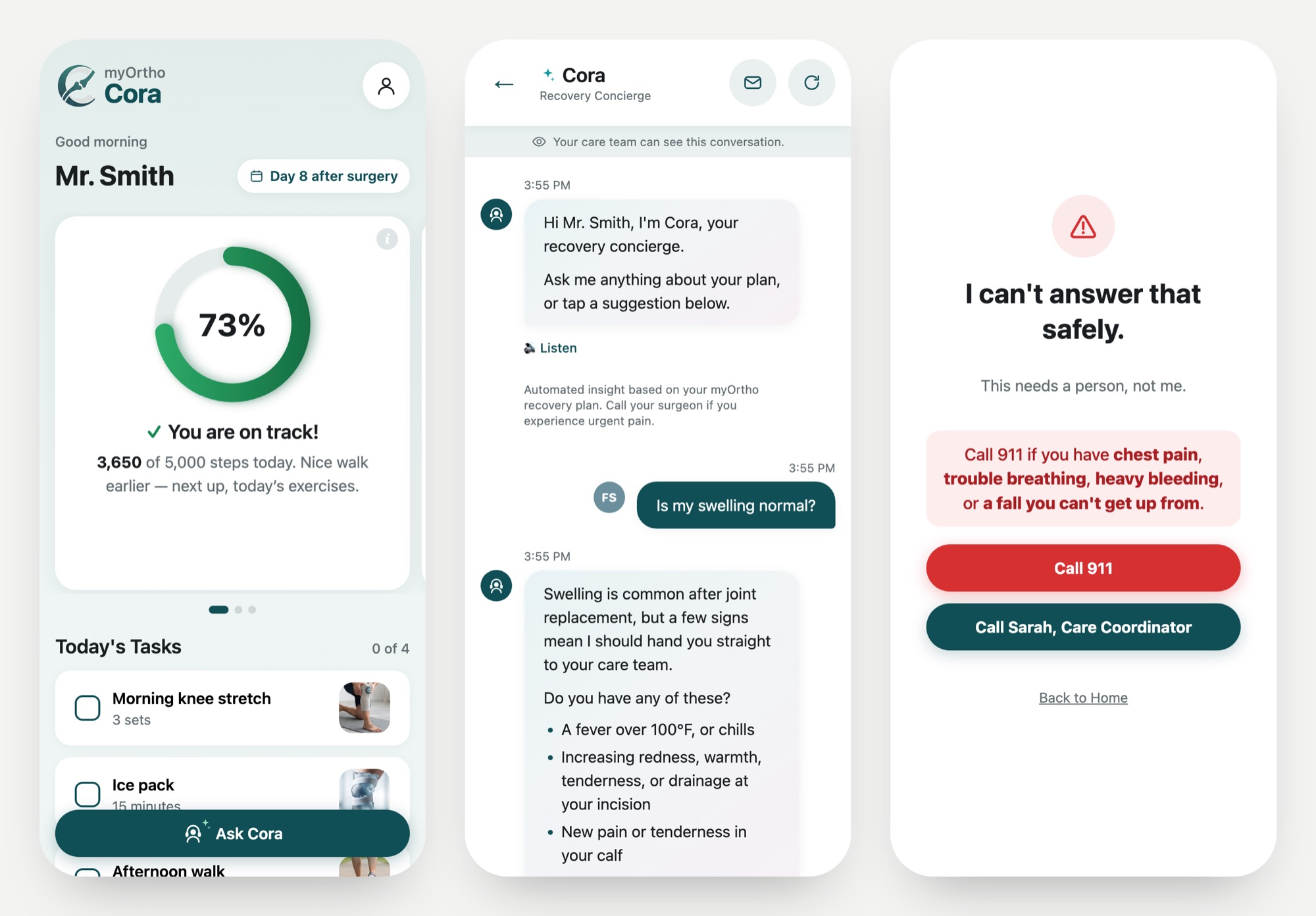
A 50-page handbook was the only guide
Older patients self-managed orthopedic recovery from a 50-page handbook. They called the wrong numbers and reached the wrong care teams, while clinicians had no early-warning signal.
In healthcare AI, I design the behavior before the screens. What the assistant refuses to say matters as much as what it says.
My process, step by step
What I did, why I chose it, and what it changed.
I listened before I designed
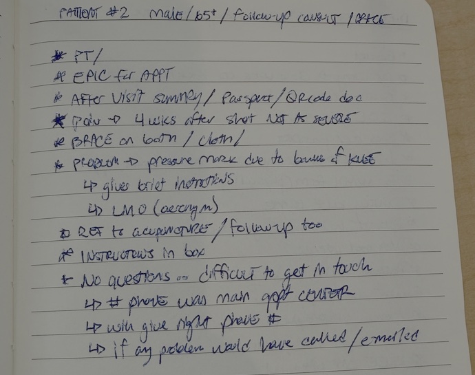
Quick surveys, then contextual inquiry with patients and care teams.
Surveys were fast but shallow, so I sat in on clinic visits with patients and their care team.
Three insights set the direction: overloaded staff, access barriers for seniors, and too many contact points.
I agreed on success before spending on design
Built a capability map with journeys and KPIs from both organizations’ qual and quant data.
Two organizations had to fund one direction. Sharing the evidence before meetings cut decision time in half.
Cross-functional leaders signed on to one plan.
I designed the AI’s behavior before its screens
Wrote the system map, prompt and component spec first, then built the screens in Project Cora.
Screens built before the rules end up decorating the wrong behavior.
Three screens with clear jobs: a calm home hub, a plain-language chat, and a safety screen the AI can’t override.
I wrote the guardrails, then tried to break them
Listed emergencies, ambiguous symptoms and near-miss phrases, then tested real patient wording against each rule.
Patients must never be trapped in automation, and constant false alarms teach people to ignore them.
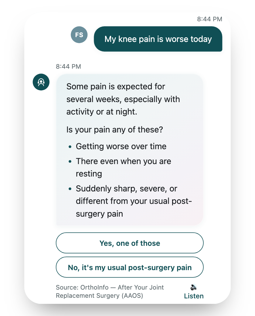
Escalate instantly on emergencies, ask one question on expected symptoms, answer everything else normally.
Treating “pain” as an emergency
My first prompt escalated on the word “pain.” But pain is expected after joint replacement, so nearly every chat would have ended in “call your clinic,” eroding trust. Now Cora asks one clarifying question from real post-op guidance and escalates only on warning signs.
Testing also showed “fallen” missed a rule written for “fall,” and “I can’t get up” had no fall word at all. I rewrote the triggers around what patients actually say.
I let patients and data settle the details
A/B tested the chat and persona voice with Product and Data Science; usability tested with 20 patients.
Tone is measurable. I wanted evidence, not taste, to decide how Cora sounds to a 70-year-old with low digital literacy.
Non-technical patients finished every core task on the first try; A/B results backed the projected 18% drop in calls.
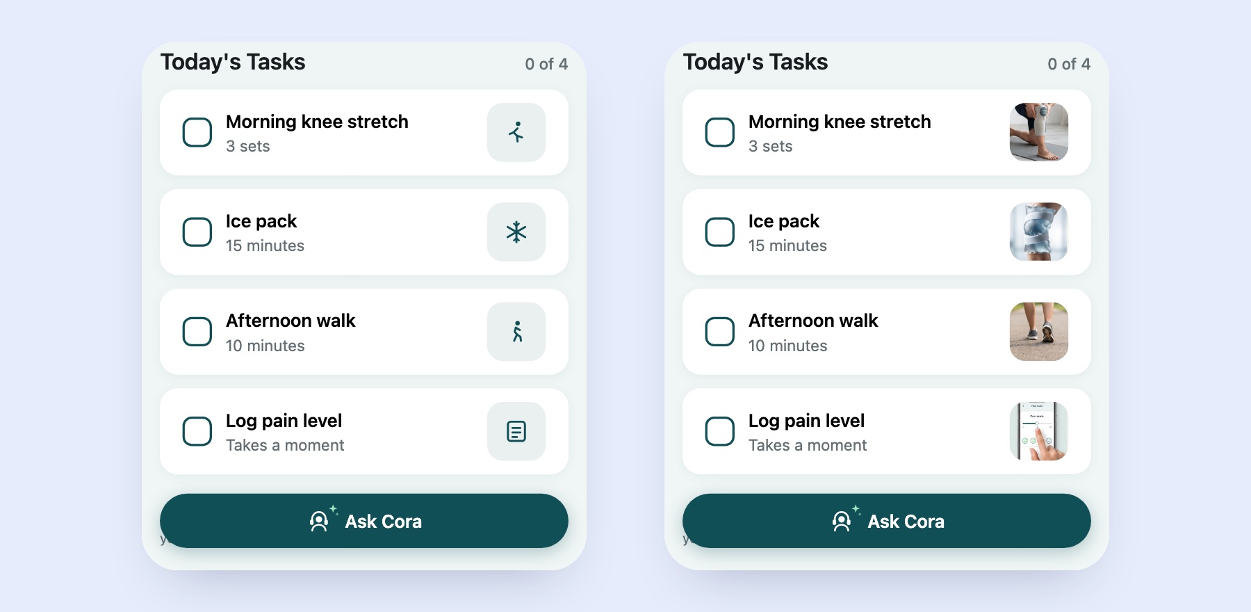
- ✓Real photos patients recognized at a glance
- ✓Slower, reading-pace typing
- ✓Short bullets in a softer tone, not walls of text
“I redesigned the point of entry, not the patient.”
With staffing constrained, I ran the usability test myself and set the design direction.
From a 50-page handbook to one AI conversation
My decision: replace the handbook maze with an assistant that gives tailored, plain-language answers, shows its source, and always offers a path to a human.
Is this normal??
Validated results, delivered in full
Every result above was validated with patients, and engineering received a production-ready handoff: complete Figma specs and token documentation.
A corporate restructuring affected the timeline after design was complete.