Self-serve onboarding & activation
Genomic-cloud workflows had steep learning curves and fragmented onboarding for B2B research teams. I led the interaction architecture, data-visualization design and usability testing that turned them into an intuitive, self-serve developer platform.
- Role
- Sr. Product Designer
Human factors & interaction architecture - Company
- Illumina
Genomic cloud platform - Users
- Genomic scientists, biotech developers,
researchers, sequencing teams - Tools · Timeline
- Sketch, Axure RP, Jira
20-day runway
Powerful science, hard front door
Scientists came to analyze genomes, not to learn cloud infrastructure.
My focus: dense analytics dashboards and conversational layers that remove onboarding and access friction.
I match fidelity to the question: decide cheaply, confirm with real data. In 2019 that meant paper first. Today AI gets me to realistic prototypes faster, but the rule still holds.
From sticky notes to shipped
Each step answers a question the previous one raised. Here’s what I did, why I chose it, and what it changed.
I cut scope before I drew anything
Prioritized user stories with stakeholders using MoSCoW.
We had a 20-day runway. Agreeing on what not to build was the fastest way to protect quality.
A focused MVP: sign-in, report access and dashboard sharing.
I whiteboarded with engineers in the room
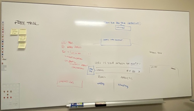
Mapped the critical flows (sign-in, report access, dashboard sharing), then whiteboarded the console architecture with the team.
With 20 days and a lean team, agreeing on one structure together avoided rework later. Trial rules set the frame: about 60 days plus a 30-day grace period, so the first-run screen had to show usage limits and warn before they ran out.
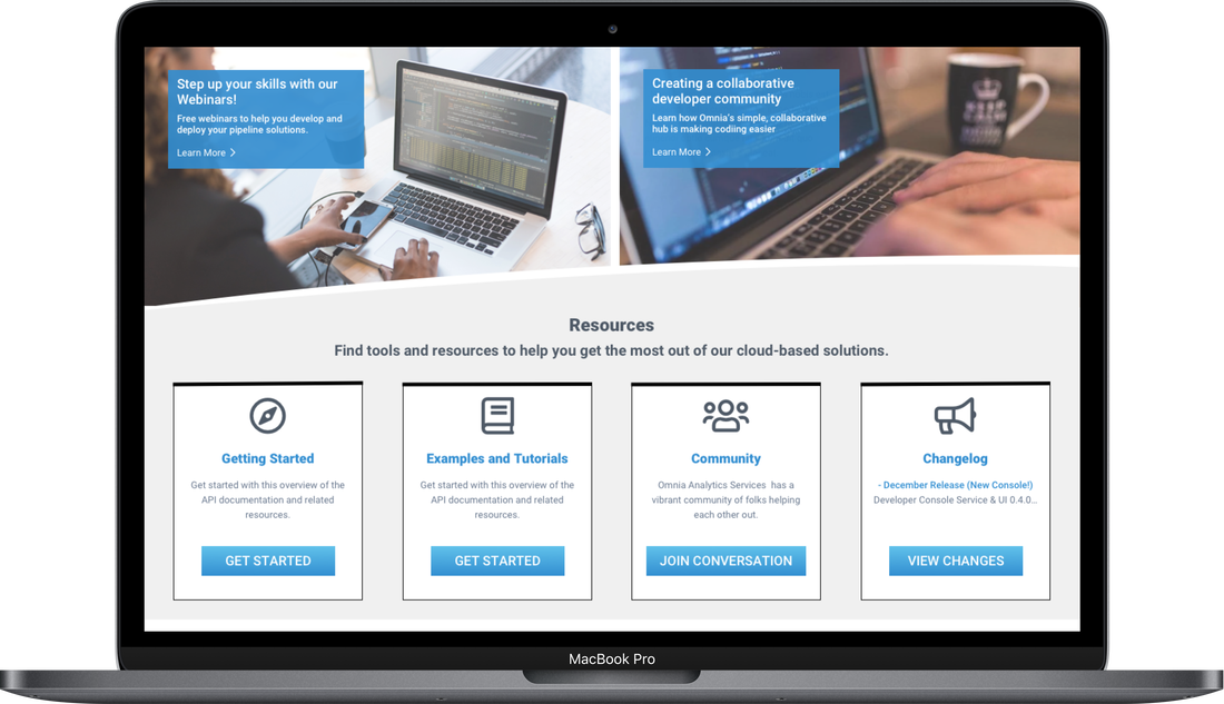
An AWS-style console: core services, tutorials and support in one place, from sign-up to first deploy.
I tested on paper first
Built paper prototypes of the key flows and put them in front of users.
Paper is the cheapest thing to throw away, and people critique it more honestly than polished screens.
Paper sessions validated the key layout assumptions; minor content changes went in before the grey wireframes.
I raised fidelity one layer at a time
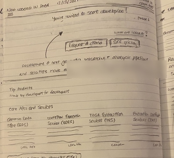
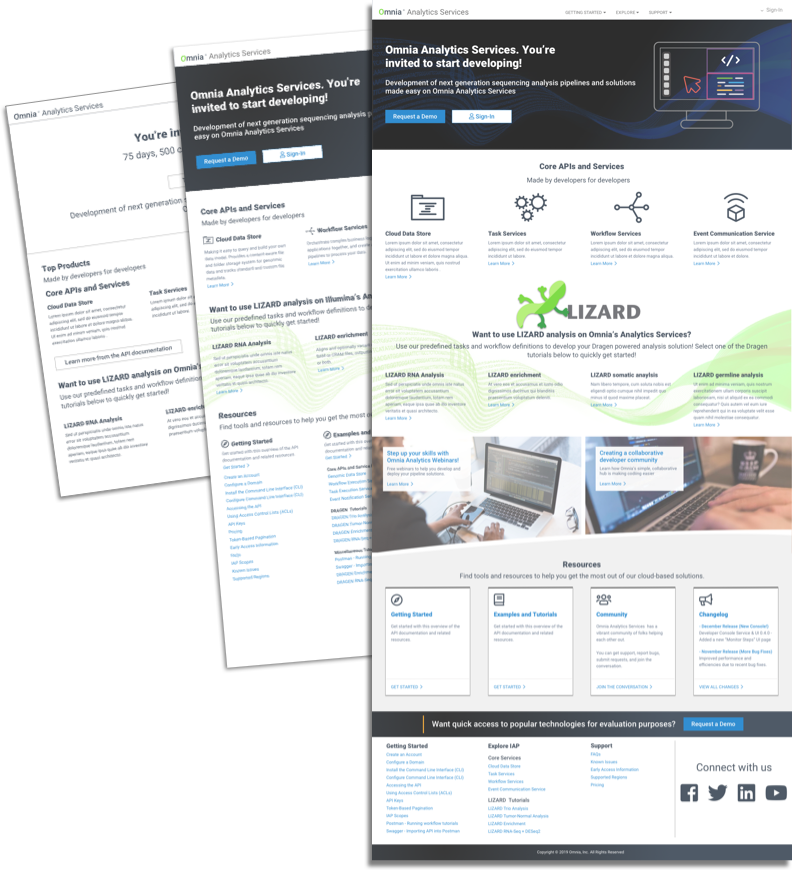
Wireframed the landing and report views in greyscale, then layered in content and brand once the structure was agreed.
Greyscale kept feedback on structure and content priority, not on color and branding.
Stakeholders settled content priority and element visibility early, then added content updates as fidelity rose. Styling waited until the core offer was clear.
I mapped the whole journey, not just sign-up
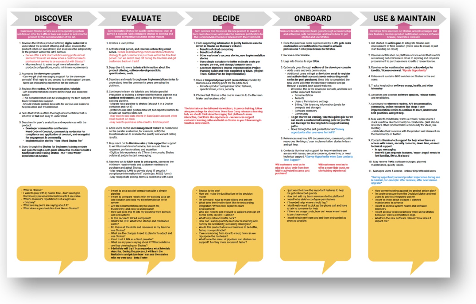
Mapped Discover, Evaluate, Decide, Onboard and Use & maintain with pain points at each stage.
Onboarding friction didn’t live on one screen. It started before sign-up and continued long after it.
It surfaced access fatigue and the missing ability to share dashboards, two findings no single screen review would have caught.
I scripted every usability session
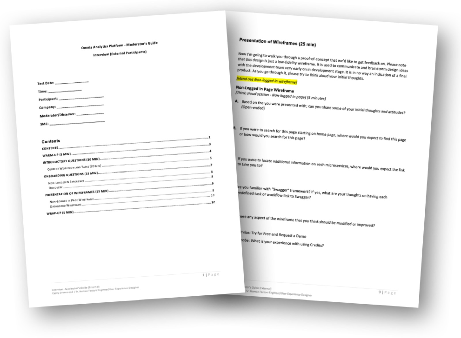
Wrote a moderator’s guide and ran 9 moderated sessions with developers across 4 countries.
Different countries and moderators produce noisy results. One script made the sessions comparable.
Five clear findings, from stability gaps to access fatigue, each tied to a platform decision.
I saved hi-fi for client validation
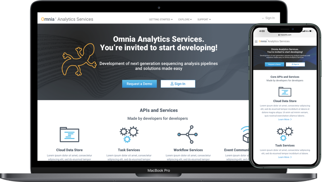
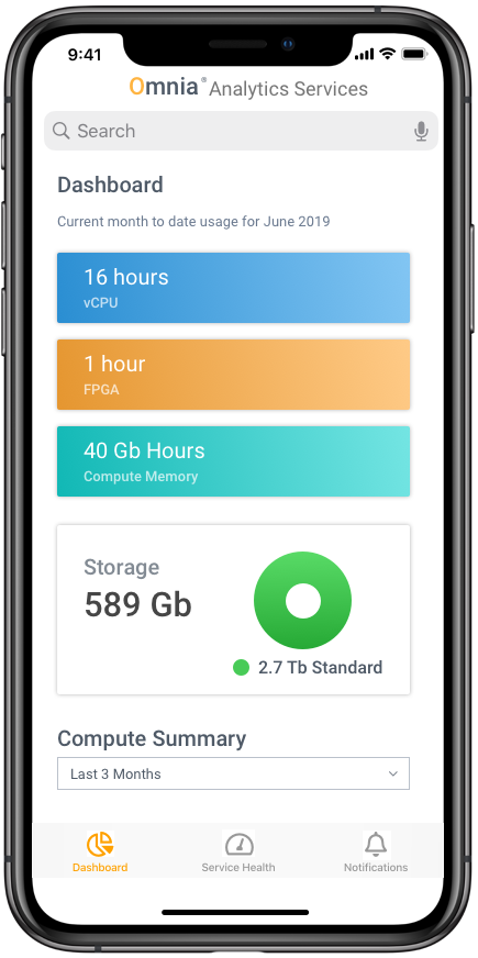
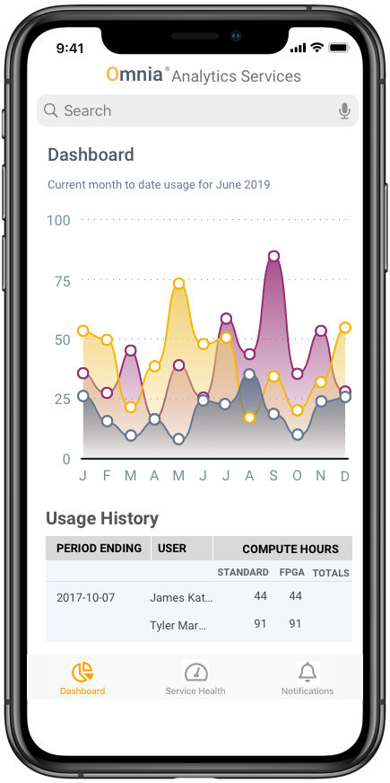
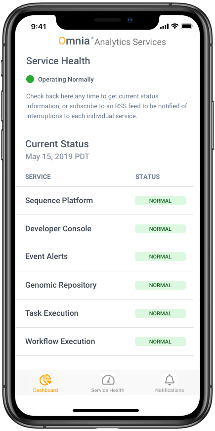
Built interactive hi-fi prototypes in Axure RP and Sketch for the sign-in, landing and report pages, plus the mobile dashboard.
Clients react to real data, not boxes. Hi-fi was for confirming decisions, not making them.
Clients validated the design before build; the MVP shipped on schedule.
Showing hi-fi too early
Some stakeholders wanted a quick hi-fi screen to review. At the time, that would have taken longer and pulled feedback toward styling before the core structure was settled. I kept early reviews in greyscale and saved hi-fi for confirmation.
What the sessions revealed
“I re-architected the platform, not the science.”
Research exposed an infrastructure gap, not a capability one, so I tied each finding to a specific platform decision.
The MVP shipped on schedule
Validated by developers before build, delivered by a lean team on a 20-day runway.
“This is a major game changer that will allow us to renew and win more contracts!”