Making fluoride data clear for the public
CDC’s “My Water’s Fluoride” app told people and health officials how much fluoride was in their drinking water, but most visitors couldn’t answer that one question. As design and research lead, I ran the research with a junior UX researcher and redesigned the app mobile-first.
- Role
- Senior UX Specialist & Web Developer
Design & research lead, with a junior researcher - Organization
- Centers for Disease Control and Prevention
Oral health program (contract) - Users
- The general public, water system
specialists, public health staff - Tools · Shipped
- Axure RP, TechSmith Morae, Zoom
Shipped 2015
One simple question, buried in technical detail
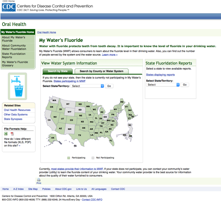
A highly trafficked federal app, built for specialists and used by the public. The redesign also had to move it onto CDC’s new look and feel. People came with four tasks:
Public health information only works if people can act on it. Answer the question they came with, then explain.
Measure, fix, measure again
Each step answers a question the previous one raised. Here’s what I led, why I chose it, and what it changed.
Measured the old app before changing anything
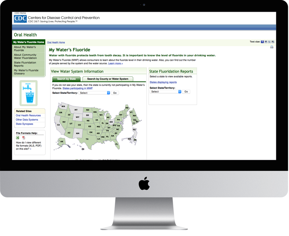
Ran a remote usability test on the existing desktop site to set a baseline for effectiveness, efficiency and satisfaction.
Without a baseline, “better” is an opinion. I wanted numbers to compare against later.
Two clear failures to fix: a confusing map, and an answer people couldn’t find.
Fixed the map that confused people
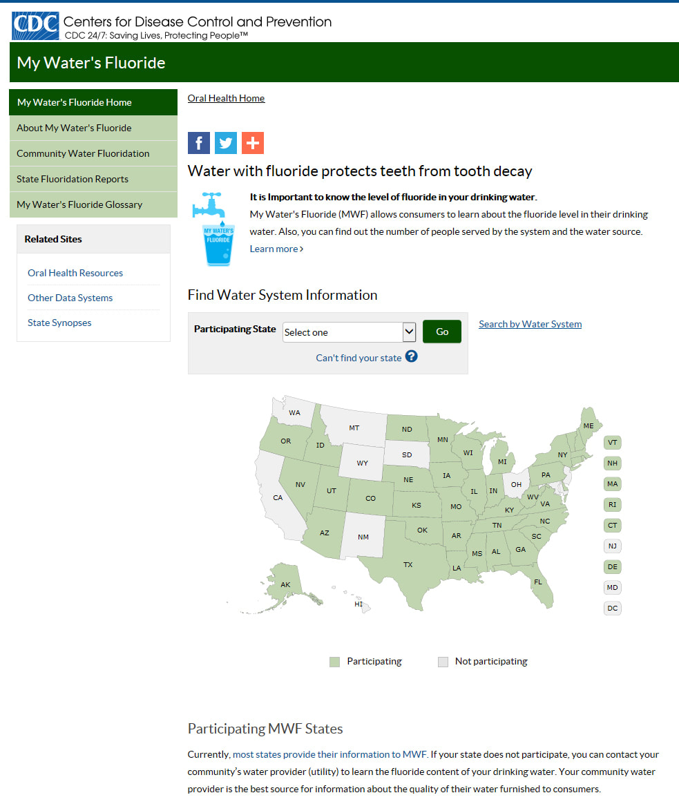
Some states didn’t take part, so they had no data. The legend sat far below the map, and clicking those states did nothing.
Moved the legend next to the map, labeled “State (Non-Participating)” on hover, and turned “States participating in MWF” into a prominent “Can’t find your state?”
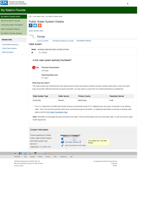 1234
- 1A direct question people actually ask.
- 2Yes or No with an icon, at a glance.
- 3“What does this mean?” explains the result.
- 4State contacts so people know who to ask.
Put the answer first, in plain language
People couldn’t tell if their water was fluoridated. The details page was technical and wordy, and the levels meant nothing to them.
A direct question, “Is this water system optimally fluoridated?”, with a Yes or No icon, a “What does this mean?” explanation, and the state health department’s contact details.
Prototyped mobile-first, then tested again
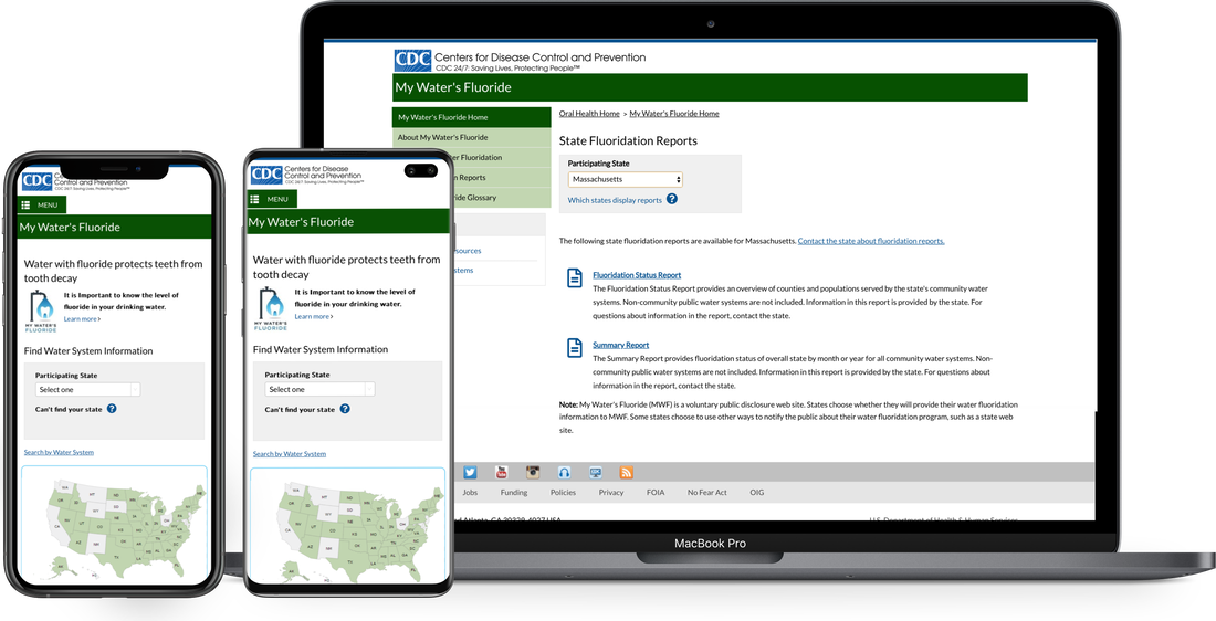
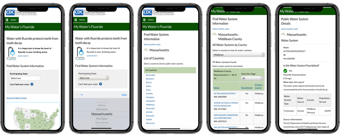
Built interactive mobile and desktop prototypes in Axure on CDC’s new look and style guide, which I helped create. A second round of remote testing measured them against the baseline and set this happy path, from home to answer.
No time for a full IRB review
Federal rules cap how many members of the public you can test with before an Institutional Review Board review, and our timeline couldn’t absorb one. I paired internal subject-matter experts with a smaller group of public participants, kept the schedule, and still got clear insight. Federal content rules also blocked some wording users asked for, so I leaned on layout, icons and white space to make it scannable.
Same question, one step to the answer
The 2015 research still holds. What’s changed is what people expect, and what responsible AI makes possible.
Is my tap water fluoridated?
Check the water system that serves your home.
Today: start from a ZIP code or location, with the map as backup.
Today: the answer comes first, shown with an icon and words, never color alone.
Today: follow-ups answered from CDC guidance with the source shown, and a handoff for anything it shouldn’t answer.
Built to WCAG 2.2 AA at a 6th–8th grade reading level, and measured by “found my answer,” not pageviews.2026 concept with sample data. Not a CDC product.
People got their answer, on any device
Public health sites for a national audience
As a contractor at CDC from 2005 to 2016, I grew from web developer into UX designer and researcher, across two of CDC’s national centers:
Experts owned the content. I built how it reached people: information architecture, design, development, Section 508 accessibility and usability testing.
Hiring a design leader? Let’s talk.